

How is our current recruitment strategy? What is the % of visitors that converted to leads compared with the last quarter? What is the current financial situation of our largest IT project? Does our firm invest now more in further training than it did 5 years ago?

Ralf Kaul, Senior Consultant, Ernst and Young
Ralf will be speaking at the Virtual IRM UK Enterprise Data & Business Intelligence and Analytics Conference Europe 2-5 November 2020 on the subject, ‘Advances in Interactive and Innovative Dashboards‘
The Conferences are co-located with the Virtual Data Governance Conference & Master Data Management Summit Europe 2020
Questions upon questions. Blending the power of data with end-user flexibility in interactive dashboards can give rise to unimaginable possibilities and insights.
In the era of digitalization, more and more companies are gearing towards interactive and dynamics business intelligence dashboards which allow them to access data in real-time as well as deliver innovative reports quicker and more accurately in order to track their goals at all levels. As technical innovations have taken leaps and bounds over the past few years, there is no doubt that analytical dashboards will further transform how companies pursue their strategic objectives.
Dashboards in the current dynamic climate
A very telling statistic to start with: according to a study conducted by EY in collaboration with the Controller Institute in 2018, dashboarding is the most sought-after technological tool. More than 92% of the 220 companies in Austria, Germany and Switzerland that participated in the studies have either already implemented dashboards or are on the verge of integrating them within the next three years.
But why is there such a great demand?
In the 21st century, the era of big data, everyone, from senior managers to operational employees, is inundated with information overload in the form of reports, emails and non-electronic memos. Processing complex and unstructured data and reports only adds to their workload. Conventional reporting tools saddle users with endless and densely packed visuals and do not provide a logical roadmap. In practice, such data should be harmonized in a logical structure which would provide a clear platform for efficient decision making.
A state-of-art BI dashboard conveys all the quintessential information supported by visuals and commentary and transforms dull and opaque information into aesthetically pleasing insights which resonates with all end-users.
However, conception of such dashboards with suitable and interactive visuals and information requires business and political nuances. It is a steady process to meet the changing demands of end-users. During a recession, a company may need to track cost-cutting measures, and as such, concise KPIs would be implemented in effective dashboards. When the economy improves, the company may change its objectives and pursue KPIs pertaining to market share and growing net sales which would then be reflected in dashboards. Following a merger with another company, the company may need to monitor the performance of a new product line, channel, or sales in a different country.
An effective dashboard in today’s dynamic environment can meet the requirements of the end-users.
But is technical know-how a prerequisite for constructing such dashboards?
Breathing life into dashboards
Tableau and Microsoft, having unearthed potential for self-service BI dashboards, are enjoying steady increase in demand for their software products, Tableau Desktop and Microsoft Power BI. Both BI tools are front-runners in the data visualization world. Users can effectively construct custom and user-friendly dashboards without technical expertise or support from IT.
The motto “data democratization” rings true.
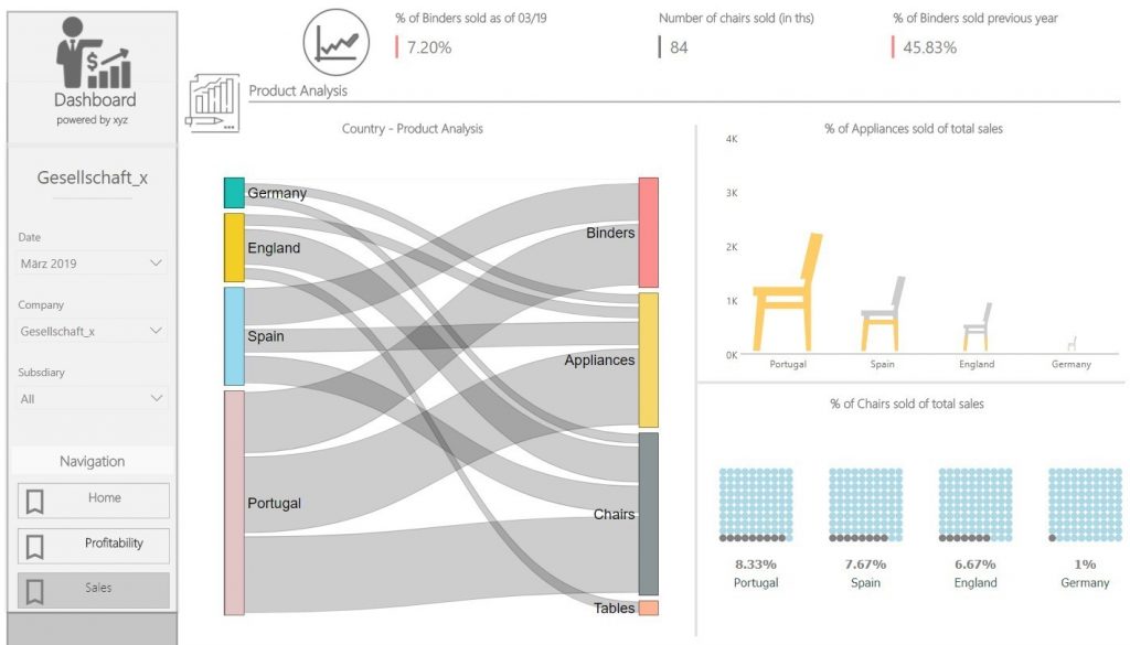
By means of intuitive user-interfaces and innovative diagrams, performance of a company can be easily monitored and analyzed. Any significant variance can be easily identified in a timely fashion.
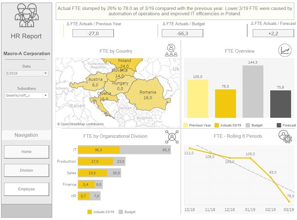
Clear and concise connections can be drawn, based on the available information. The design of a dynamic dashboard plays a crucial role in delivering such data transparency and message. A structural storyboard allows end-users to navigate through the report and the information is supported by innovative and meaningful diagrams. These dashboards can be interactively operated by their users and interactions are supported by zooming in on visuals, filters to alter the story, drilldown to reveal underlying data and mouse-over to display tooltip.
The purpose of BI dashboards does not stop at just data visualization and presenting backward-looking information. There is an obvious need to spark discussions relating to the performance. For instance, how much additional workforce is required if we outsource IT projects to an external vendor? Or how much of an impact does the outsourcing have on our personal expenses?
In such a data-driven era, the speed to attaining such insight and information is becoming even more essential and such predictive abilities, which are performed by the software to some extent, is expected to be even more prominent in the coming years.
The way forward: Machine Learning
More recently BI dashboards have built-in AI features which offer fascinating insights and forecasting based on past data. These predictive features are expected to be even more intuitive in the coming years and “what if”- scenarios are also expected to be further explored. These scenarios would draw educated predictions and offer insights into new business models and ideas.
The question remains, will this be a game changer for the future?
Ralf Kaul is a senior consultant in Finance – Performance Improvement at Ernst and Young since February 2019. Previously, he spent 7 years in financial controlling in banking and asset management. His focus lies on controlling and in particular on the conception and implementation of analytical and interactive reporting. He emphasizes the use of interactive BI dashboards to optimize decision-making processes at the management level and across all domains of companies.
Copyright Ralf Kaul, Senior Consultant, Ernst and Young
References
EY Controlling Panel 2018 Key Findings: https://www.ey.com/at/de/newsroom/news-releases/ey-20180307-controlling-panel-2018