

Fact 1: process management seeks to improve organizational performance.
Fact 2: to manage a process effectively, its performance must be measured reliably.

Roger Tregear, Principal Advisor, TregearBPM
Roger presented a workshop at the Virtual co-located Business Change & Transformation Conference and Business Process Management Conference & Enterprise Architecture Conference Europe 27-28 October 2020
The call for speakers has now been published for the Virtual IRM UK Business Change & Transformation Conference, click here for more information.
This article was previously published here.
Despite these undeniable facts many organizations struggle to make process performance a key part of organizational performance measurement and management.
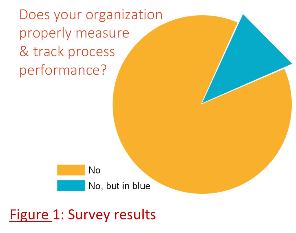
The fictitious survey result illustrated in Figure 1 is all too often an embarrassingly accurate assessment of what really happens, even in organizations with an apparent commitment to process-based thinking and acting.
Why is that?
One clear issue is the seemingly overwhelming scale of the whole-of-organization process view and its management. There are thousands of processes in a process architecture. It’s hard to imagine any scheme that can effectively measure and manage them.
And that is true, so don’t try. It’s not possible to actively manage thousands of processes. To keep it practical, useful, and sustainable pick the high-impact processes for close attention. That’s maybe 20 or 30 processes that are key to overall performance. Even so, 30 continually executing processes generate massive amounts of data, and performance levels are always changing, and things are always happening. There is a lot going on. Is it possible or desirable to try to manage this data avalanche? No, it’s not.
The good news is that it doesn’t have to be like that.
Not all data points are equal. A lot of time and effort can be wasted in listening and responding to noise that should be ignored. The solution is to find signals in the noise and strategically invest in them.
3 core concepts
In this column I want to (re)introduce what I think is the most important process performance management tool ever invented, the Process Behavior Chart (PBC), aka the XmR Chart. Before we get to the PBC details, there are three important concepts to understand: variation, predictability, signals.
Living with variation
There will always be variation in a performance dataset. We measure variables, not constants. If it’s not changing it doesn’t need to be measured. The purpose of measurement is to know how much variation there is. Then we can assess if the level of variation is acceptable. Is the variation normal and routine or is there something special or exceptional about a measured change? Has there been a variation that warrants our intervention?
Here is the simple idea that allows us to avoid the avalanche: a process with predictable performance will vary within known limits unless something happens to change that performance. Such a change might be deliberate, i.e. the result of some process improvement activity, or unexpected. The limits of routine variation are an attribute of the data alone and are calculated with a simple formula. Those limits remain valid until some exceptional (non-routine) change occurs, and when it does the data will signal the change.
There is nothing to be gained by looking for the causes of routine variation. There is much to be gained through analysis of the (much less frequent) exceptional variations – find what caused the variation, assess whether the impact is enough to warrant intervention, and if so, remove or amplify the cause as appropriate.
There will be variation. To manage process performance effectively and efficiently, that variation needs to be predictable and within known and acceptable limits.
Predicting the future
A key process performance management question is “What will happen next?” While it is important to understand and learn from what has already happened, an essential test of effective management is whether future performance can be predicted with any useful certainty? If not, management must be reactive rather than active, indicating a low level of control over the process and its outputs.
A stable process is one where its performance can be predicted, with a high level of confidence, to be within known limits unless something changes. We can be sure that such a process will continue to operate within those limits absent a change.
Of course, performance may be predictable but not acceptable. Being predictable just means that we can be confident that we have a good idea what will happen next. Whether that outcome optimizes performance is a different question.
Finding signals in the noise
Imagine a crowded room (remember those!). Lots of noise – a steady hum of conversation, much laughter, perhaps music, occasional louder voices, maybe external sounds from street or sky. It’s all background noise, another soundtrack of life, and it mostly passes by unremarked. Occasionally, a noise is recognized and tested for relevance – someone you know, a sound that might indicate alarm, a phone ringing (is it mine?).
It would be very distracting and wasteful in that busy room to attempt to identify the cause of every sound. So much effort would go into trying, and failing, to identify all the root causes that the objective of being there would be lost. We don’t chase every sound but search, if unconsciously, for signals in the noise.
We also need to adopt this approach in analyzing variable process performance data. Distracted by the noise, we can a miss signal that something important has occurred.
In analyzing process performance data look for the signals that indicate something has changed about the operation of the process. React to the signals, not the noise. Noise reflects routine operation. Signals will appear in the data if something worth investigating has changed (with either a planned or unplanned cause). Simple rules allow for easy identification of such signals in the PBC.
The Process Behavior Chart
The PBC is the filter that captures knowledge enabling the ability to predict process performance which, in turn, empowers effective management.
100 years of development
A legacy of the work of Walter Shewart, Edwards Deming, and Donald Wheeler, and based on 100 years of development and use, the PBC is a powerful tool.
Previously called an XmR Chart, Wheeler suggested the new name, and other related language changes, in the second edition of his book, Understanding Variation, a book that is a must-read for anyone looking to track process performance.
Another book that provides useful, practical insights into developing and using a PBC for process management is Measures of Success by Mark Graban.
It is my intention in this paper to provide a good overview of the development and usage of a PBC. To get the details, read either or both of Wheeler and Graban.
Anatomy of a PBC
An example PBC is shown in Figure 2.
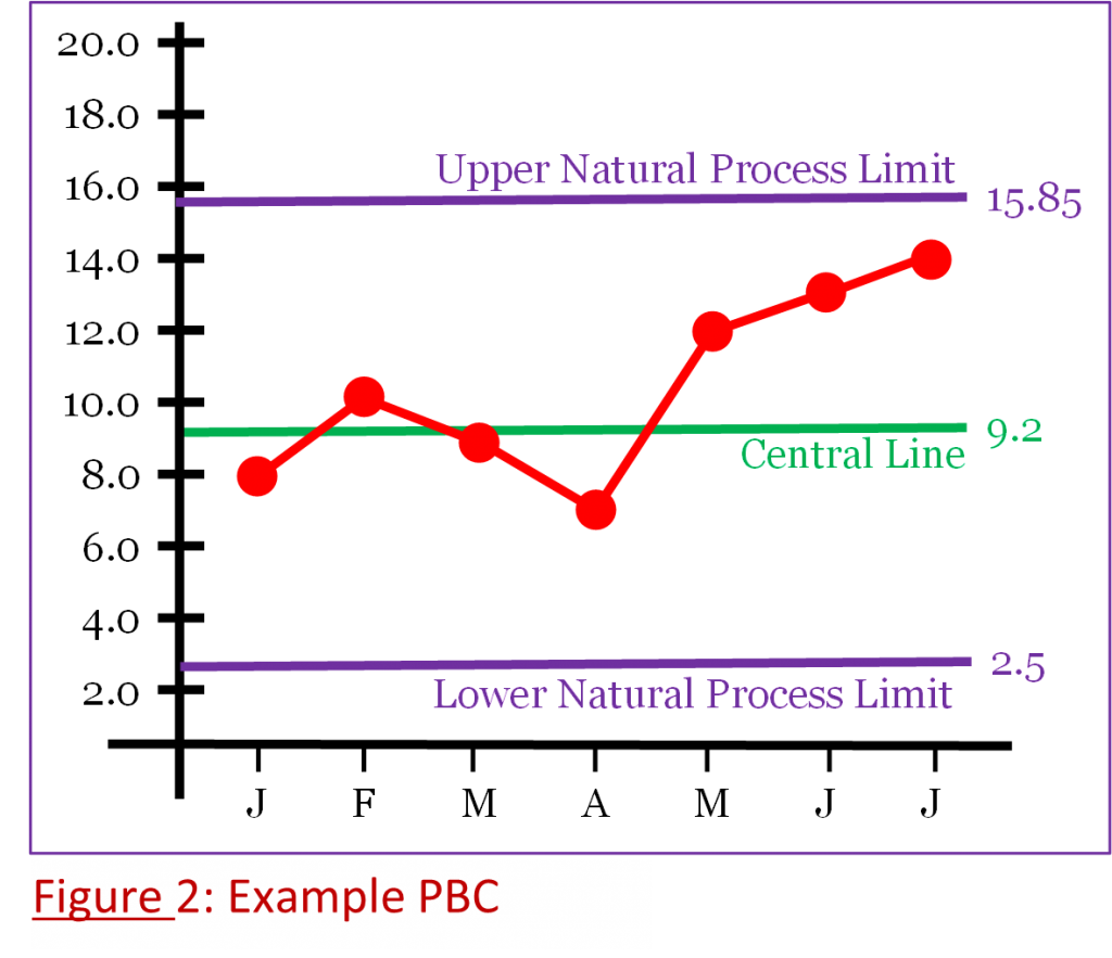
To be accurate, this is only part of a complete PBC. It is the X part of the XmR Chart. In practice the X Chart (Figure 2) is used much more often than the mR Chart. See Wheeler or Graban for details.
Measured values of a process KPI are plotted as a time series of data points and are shown here in red.
The Central Line, shown in green, is the average of a sample of those data points and represents the predictable average performance of the process.
The Upper and Lower Natural Process Limits (NPL) are calculated numbers based on simple arithmetic involving the averages and a constant. They indicate the range within which 99+% of data points will occur for the process as currently operating.
A predictable process, i.e. one operating within the limits, is operating at its full potential. Changing performance requires changing the process.
Using a PBC does not require a postgraduate degree in statistics. Rather, it needs the ability to apply the simplest of formulas.
Using a PBC
Making a PBC a practical process management tool is also remarkably easy.
Having established the upper and lower limits and the central line using the baseline data, ongoing performance data is collected and plotted looking for signals.
A signal is a sign of the occurrence of an exceptional variation with an assignable cause that will be worth identifying and analyzing to enable elimination or amplification of the cause to improve the performance of the process.
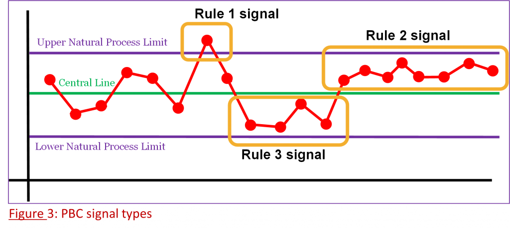
There are three types of signals as shown in Figure 3.
- Rule 1: 1 or more data points outside an upper or lower NPL.
- Rule 2: 8 consecutive points on the same side of the central line.
- Rule 3: 3 out of 4 consecutive points all closer to an NPL than to the central line.
A PBC answers the question “Has a change occurred?” If there has been a change, there will be a signal. If there was a signal, there was a change that is worth investigating. Importantly, the opposite is also true – we don’t chase the routine noise in the absence of a signal.
PBC signals don’t say what caused the change or what should be done about it. The PBC says whether a process has predictable performance, and that performance might be predictably bad.
To respond to this ‘voice of the process’ we react to signals and, if needed, investigate noise.
In reacting to a signal, we are taking immediate short-term action to respond to the root cause of the signal. Investigating noise takes a broader more systemic approach aimed at raising or lowering the central line and, perhaps, narrowing the limits.
The practical cycle of PBC use is that we first set up the PBC using a set of baseline data, then plot the data points until there is a signal. Once we have enough data points (minimum five) beyond the point where the start of the signal was detected, we redraw the chart with a new central line and natural process limits.
Has there been a material change in the performance of the process? If so, was it expected? If not, what was the cause? Is an intervention warranted?
And repeat, searching for any signal that a change of consequence, or lack of an expected change, has happened or might be about to happen.
Search. Signal. Analyze. Redraw. Respond. Repeat.
Building a PBC
A short note and example about the basics of build a PBC. Figure 4 refers.
- Set up the axes as required and plot the time series data points (X).
- The central line plot is the average (AvgX) of the same baseline data points. A minimum of 5 data points is needed and sufficient. More can be used, and the accuracy may increase, but the incremental benefit is negligible beyond 25 points.
- The Moving Range (MR) for the data set is the absolute value of the difference between consecutive values. Calculate the average MR (AvgMR).
- Natural Process Limits are calculated as follows:
Upper NPL = AvgX + 2.66*AvgMR = 9.2 +2.66*2.5 = 15.85
Lower NPL = AvgX – 2.66*AvgMR = 9.2 – 2.66*2.5 = 2.55
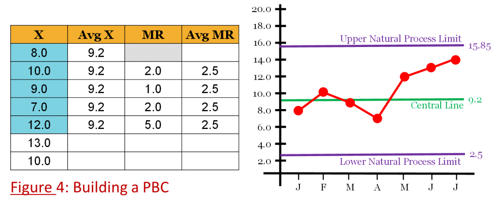
The PBC in Figure 4 tells us that, as long as the process is not changed, the value of this KPI will very likely vary around an average of 9.2 and we can expect values from 2.5 to 15.85. The process is predictable with a high level of confidence within that range. If that level of performance is acceptable, and in the absence of any signal, we can ignore variations within the 2.5 to 15.85 range because they are caused by routine noise and will not have an assignable cause.
Read that paragraph again. That’s a very big deal. We just radically reduced the process performance tracking workload.
Further notes about the PBC
In using the PBC we need to remember:
- Natural process limits are calculated, not chosen. They are not targets and the PBC doesn’t care if you like them or not!
- A PBC indicates when a performance intervention is warranted, but not when there is a new idea to be tested.
- PBC signals may have been either expected or unintended. Therefore, we find a signal and explore the cause, or make a change and look for a signal of success.
- A PBC does not require any particular data distribution, they work for any data distribution, e.g. Normal, Binomial, Poisson etc.
PBCs work for both count (discrete) and continuous (rate) data types. Other chart types (np, p, c, u) are not needed[1]. (Send your arguments to Dr Wheeler! 😉).
Signals in the noise
Donald Wheeler neatly sums up the theory and practice of process behavior charts for us: PBCs are a way of thinking with tools attached.
We can, and should, listen when he also says:
“Process behavior charts work. They work when nothing else will work. They have been thoroughly proven. They are not on trial. The question is not whether they will work in your area. The only question is whether or not you will, by using these tools and practicing the way of thinking which goes with them, begin to get the most out of your processes and systems.” [Understanding Variation].
Using a PBC allows us to focus on what is important and avoid chasing shadows. It is a vital aid in making the process of process management and improvement our most efficient and effective process.
Roger Tregear is Principal Advisor at TregearBPM with 30 years of BPM education and consulting assignments in Australia, Bahrain, Belgium, Jordan, Namibia, Nigeria, Netherlands, Saudi Arabia, South Africa, South Korea, Switzerland, New Zealand, United Arab Emirates, UK, and USA. His working life involves talking, thinking, and writing about effective process-based management. Roger is a columnist at BPTrends and the Business Rules Journal. He has authored or co-authored several books: Practical Process (2013), Establishing the Office of Business Process Management (2011), chapter Business Process Standardization in The International Handbook on BPM (2010, 2015), Questioning BPM? (2016), Reimagining Management (2017), Process Precepts (2017).
Copyright Roger Tregear, Principal Advisor, TregearBPM
[1] Donald Wheeler calls the PBC the “Swiss Army knife of control charts”.