

In my last post I discussed crafting the structure of a presentation. In this post I’m going to take you through some of my thoughts regarding how your deck should look. I would stress this is simply my opinion on how slides should look based on my years of experience and also from being part of the advisory boards for BA Euro, where I have listened to many great snippets of advice from my peers.

David Beckham, Principal Consultant, ChuDo Consulting
David has spoken regularly at the annual Business Analysis Conference Europe. View more information on this year’s Business Analysis Conference Europe 2020, which takes place 21-23 September 2020 in London. David is a member of the BA Conference Europe 2020 Advisory Board. This article was previously published here.
View the previous entries in this blog series: Part 1, Part 2, Part 3, Part 4, Part 5
The call for speakers for our Business Analysis Conference Europe has just been published click here for speaker and submission guidelines and to apply online.
I also tend to use Powerpoint but, before we kick off a debate about the ‘true ruler’ of presentation software I acknowledge there are other applications out there that do an equal, if not better job in some aspects; I just don’t happen to use them. Hopefully my advice will be generic enough to be useful on whatever software you bend the knee to!
So to start off with here’s a few hints and tips that I have found useful to consider, in no particular order:
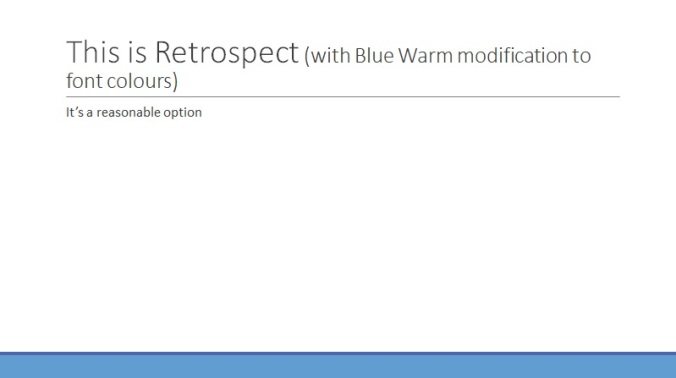
Design – keep slides tight, clear and un-cluttered. In terms of designs I tend to favour white slides with a simple dark red font or black slides with a white or bronze yellow font. Powerpoint can auto-suggest designs if you allow it on certain versions but I tend to find these a bit too gimmicky. If you do want a design on your slides I would go for something simple such as the examples below.

Font – in my view it is best to avoid ‘cute’ fonts like Jokerman or Chiller as they are nigh on impossible to read on a slide. Impact can be used in moderation to do what it says on the tin but mainly I tend to use Calibri, Times New Roman or Tahoma. As to font size I think somewhere between 28 to 40+ is fine and anything under 20 is likely to cause the audience to struggle. Some events issue guidelines regarding these so it’s worth checking them out. Also, be wary if an organisation asks for your slides in advance and then pastes them into their own deck as it can completely mess up the format! OH AND CAPS LOCK IS STILL REGARDED AS SHOUTING….
Text – Avoid the temptation of cutting and pasting huge amounts of text. I personally would rather have an eye-catching slide with a few key bullets on it, than attempt to transpose War & Peace…. There’s a limit to how much the human brain can continuously absorb as we are presented at. Avoid the mistake of displaying miles and miles and miles and miles of text with very little break your audience will soon begin to drop off into the abyss of fuzziness or the lack of any break in cadence or rhythm will slowly drive them off their cake until they can take no more
A common mistake that emphasises the previous error is breaking the prime directive of presenting which is “Thou shalt never say the same thing as your slides” A great quote used by many writers on presentation skills is “If you and your slides are saying the same thing, one of you doesn’t need to be in the room”. This is really worth remembering but can be very hard to do; occasionally I still find myself accidentally reading my slides and at that point force myself to look away from them. It gets easier to ignore your slides the more you practice a particular session so I recommend that you try and get as much practice as you can! If you do need help remembering your content (when using Powerpoint) use the notes box and then display your slides in ‘presenter view’. You will be able to see your notes but the audience will see only the slides. (This is only the case where you can extend your slide deck onto the wall via a projector).
Images – the use of simple images can add a huge amount of value to a presentation, as long as they are relevant and clear. Before using images you might want to consider any copyright issues (Particularly if your slides are likely to be published on the internet) and also their resolution as grainy images can spoil the effect. Complex graphs etc should be simplified as much as possible and you should never, ever, ever utter the phrase “Of course, you won’t be able to read this slide…..” or the Gods of Presenting may strike you down with fruit and vegetables……
Animation – I use animation quite a lot to ‘build’ slides i.e. have them appear in the order and pace I want them. This can be particularly effective when you get used to it as you can talk through the slide points without having to click through them. I’m not going to get into the nitty-gritty of the animation process as it will take too long but suffice it to say you can experiment with various styles until you find the one you like. I would recommend avoiding some of the more frenetic animations though as they can get tiresome and distract from the content of your talk.
In general, it is best to remember that the audience is there to see/hear you, not marvel at your slide deck!
In the next instalment of this series I shall look at some of the practical skills of presenting, such as maintaining confidence, working the room, body language etc….
David Beckham has spent his career working at Aviva and has been a Business Analyst in different guises since the mid-90’s. He was a founder member of the Business Analysis Practice when it was formed within Aviva IT and has had two terms as the Practice Lead. He has worked on numerous large change programmes and has been heavily involved in building the capability of Business Analysis within his organisation over the last few years. He has presented at the European BA Conference on a regular basis and has had several articles on Business Analysis topics published through various media. Despite being diagnosed with Parkinson’s Disease in 2010 at the age of 43 David continues to relish his role as a Business Analyst and is a passionate advocate of the profession and the benefits it gives to organisations everywhere and regularly speaks on the positive power of change both on a professional and personal basis.
Copyright David Beckham, Principal Consultant, ChuDo Consulting